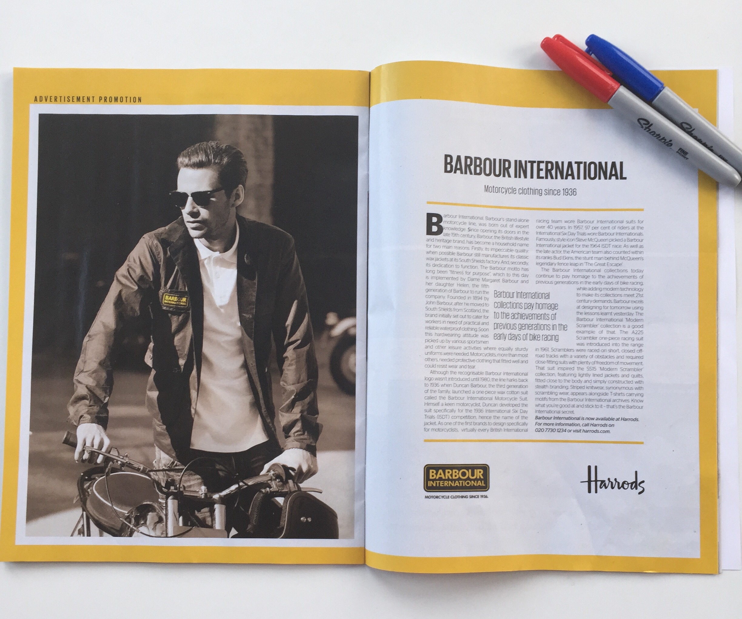
Regular readers of this blog will know I have a problem with copy heavy advertising. Put simply there can be no justification for acres of copy which are never read by the target consumer. It's wasteful of the opportunity.
Any yet brands continue to do it, especially the smaller ones who labour under the illusion that they need to sweat the opportunity by cramming as much in.
Now to be fair the example below is an 'advertising promotion' and the presence of the Harrods logo suggests it's some sort of co-branded collaboration but that's no excuse.

Dull, almost anemic, wordy and when you consider the publication it appeared in the crime is doubled. ES is the magazine of the London Evening Standard distributed on a Thursday evening - it's an evening commute publication and so it's designed to be a fast paced read. Highly visual and engaging.
It's all the more tragic because this is a great brand which is having a resurgence - shame this was an opportunity missed.