Build it and they will come. Sometimes.

A few weeks ago a pleasant Saturday late afternoon flick through my Instagram feed was ruined by the news from someone I follow that the Jack Spade store in London had closed permanently.   He had just made his last purchase there.

Disbelieving and hoping the individual concerned was wrong I checked and sadly it was all confirmed.   The parent company Kate Spade & Co had shuttered the 19 Kate Spade Saturday stores  - this intrigued me so I dug a little deeper and was not at all surprised this had been necessary although completely surprised that the concept had been advanced in the first place, but I digress - along with the 12 global Jack Spade stores.

Still not believing this I made sure I went past the Brewer Street store at the first opportunity.
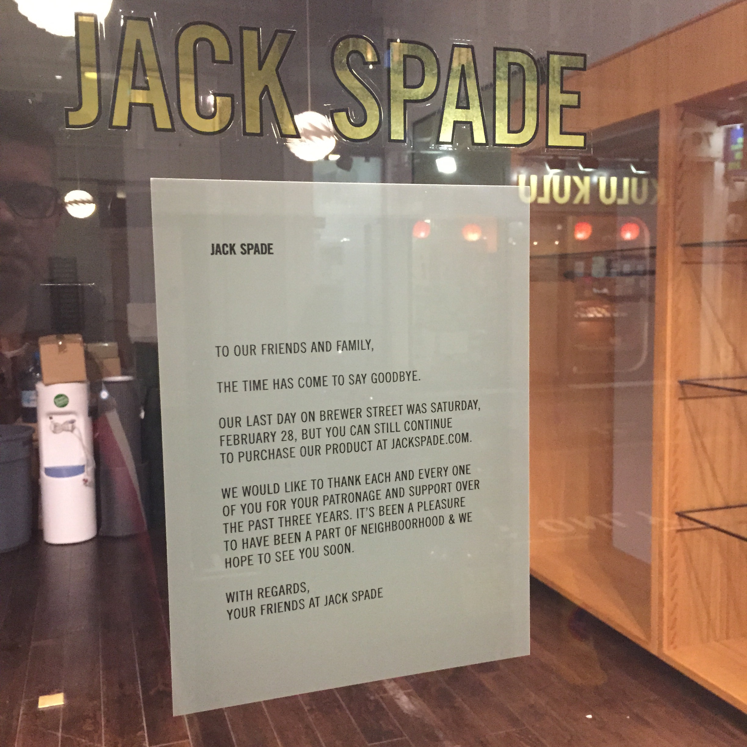


Bad news confirmed.

So why the disappointment ?  Well I love the brand.   It's biggest strength is also its biggest weakness - indistructable longevity.  Jack Spade stores are, correction were, cool and staffed with incredible characters who remembered each customer and who took the time to work out your requirements.

But I was always conscious that 'footfall' was low.  It's a challenge for all brands but especially smaller ones.   A physical store establishes credibility (although there are other ways) but it also creates a massive cost centre.   For a relatively nascent brand that's trouble.

But it needn't be.   Brands need to rethink their approach to retail.   A physical store is a sunk cost - keeping the lights on after hours and adding a few staff are minimal costs but the opportunity to sweat the asset and create experiences which pull in loyal and new customers is limitless.

Instead the retail environment is almost always abandoned after hours.   

There may have been non-Jack Spade reasons why this route to market failed (and that's a pity because this is a brand that should thrive) but I also think that the plan to make this outpost of the brand a vibrant contributor was missing.   It's a shame because anyone who visited that store was both well served by the staff and  he product they bought.

If you're responsible for a new store opening then have a plan in place for at least 6 -12 months in advance with activation ideas - attracting customers in during and after hours - make it a true brand cathedral and a commercial success rather than a line item that bleeds red.

The Long Near for the long AND short haul

Last Thursday I attended a trend briefing from The Future Laboratory thanks to being a subscriber to their essential LS:N Global service.  This concentrated afternoon session was centered around the concept of the "Age of the Long Near".   It focused on three key areas:

  • Whole-system Thinking
  • The Optimized Self
  • The Immortal Brand

It's not the purpose of this blog to go into detail on the topics (although I'm happy to sit down and talk about them if you have a moment) beyond a couple of very lasting thoughts which emerged out of the 'toolkit' (more of that later);

  • Build for purpose not for short term
  • Think beta, not finished
  • Plan for re-invention, not just change
  • Target mindsets, not demographics

It's no surprise that these all fitted the overarching narrative of the day - that of the long term - critically it all boiled down to the essential requirement to take a step back from the day-to-day and to think beyond the immediate horizon.  That's challenging in any organisation / enterprise but it has to be done.    Blaming a lack of resources for a behavior that is potentially not income generating and is somewhere over the horizon is a poor excuse and I would argue that just the mere act of thinking beyond the here-and-now helps elevate performance NOW.   It's also incredibly difficult to deliver the right things today without a strong sense of vision about the future.

Here the Future Laboratory help keep some focus - as lofty as some of their insights are they structure each major one into DRIVERS > IMPACTS > CONSEQUENCES > FUTURES and, most importantly, finish with that 'toolkit'.     Apply the toolkit to your business and thinking and you are half way there.

Of course there is a wider force at play that these insight sessions deliver.   They get you thinking.   External stimulation is critical to deliver that spark of creativity - it is brain food pure and simple.

Cash rich, time poor - Apple Watch

I'll start, upfront, by stating that I believe that the Apple Watch will be a commercial success.  They will sell huge volumes at all price points. The Apple juggernaut will continue to speed along. Now that's out of the way what do I really think ?

Firstly, there can be zero doubt that Apple is now a fully fledged luxury brand.  Back in September 2013 after Apple launched the iPhone 5c and 5s I wrote that "Apple should have gone for a wider price point range accelerating growth in new markets (getting more users) and doing more to create a genuinely more luxurious top offering with real material differentiation, commanding a much higher price (retaining HWI and opinion formers)."    I didn't get everything spot on in that blog post but I've been proven right with my thinking on Apple becoming a more luxurious brand with bold vertical range expansion.

That vertical expansion came alive yesterday in San Francisco.   It raises revenue, expands appeal and enhances the entire brand proposition at the moment when it seemed that everyone owned an iPhone.  There can be no doubt that Apple is now a luxury brand.

Up until now their pricing could become stratospheric but this was based on tangible and rationale things - screen size, memory size, speed.   With the Apple Watch Edition Collection and an model priced at $10,000 Apple have made it clear that they are determined to win a share of very discretionary spending.

Over the coming days and weeks there will be many reviews of the Apple Watch from people with much more technical insights than me but I would like to address what I see is the principle weakness of Apple Watch.   Battery life.

Battery life is the curse which bedevils all of Apple's smaller devices.   Take the iPhone 6.   A slightly improved battery performance but sill nowhere near to meeting the needs of a busy professional.   I defy anyone to take it off the charger at 6am and still be going strong at 6pm.   And for many people there is still another 6 hours before they get home.

My work around ?

FullSizeRender

A suite of external battery packs which I select depending on what my plans are for the day / evening.   In actual fact what that really means is I now don't let my new Anker pack out of my sight.  It's heavy and wieldy but with 10 full iPhone 6 charges in it I can relax and come to the assistance of lesser mortals when the need arises.

Usability and addictive qualities are two of Apple's biggest strengths......and weaknesses.   They, and the developer community, have created game changing apps and functionality which result in high usage.

A few years ago, in a different guise, I can clearly recall a spirited discussion with a product manager when I asked about the battery life of a pending new product.  He kept quoting the 'standby' stat and I kept asking what that meant in terms of real use.   If a device is not switched on or used it has a battery life you can measure in days and weeks !   But that's not the point.

You switch it on and use it.

Which makes Apple's heavily caveat-ed Apple Watch Battery page deeply concerning.    The phrase "actual results may vary" is applied to every statistic. That combined with personal experience makes me sceptical of the published "18 hour" battery life - which is based on a minimum of usage.    So let's be generous and say that with moderate use the life is 12 hours.    Your busy entrepreneurial high net worth will hit the gym at 6am - which means by dinner time, just the moment he or she might want a discrete communication and information device on their wrist (more subtle than checking your phone during a business dinner) the battery makes the thing as useful their first Timex.

People put on a watch in the morning and they take if off at night.   They are not in the habit of charging it during the day.   And, remember a tethered Apple Watch to an iPhone will also drain the iPhone battery.   So now your busy wearer has to worry about charging two devices at some point.    I just don't think the world is ready to see $10,000 gold watches hanging from a spare mains outlet in a bar, restaurant or airport lounge.

As I said at the beginning I do believe they will sell a lot.  I just reckon that a lot of them will end up discarded in the bedroom drawer after a few months.

Although there is one solution.   You can buy two and swap them over during the day. Maybe that is the plan all along.  Why spend $10,000 when you can spend $20,000 ?!

A perfect serve 

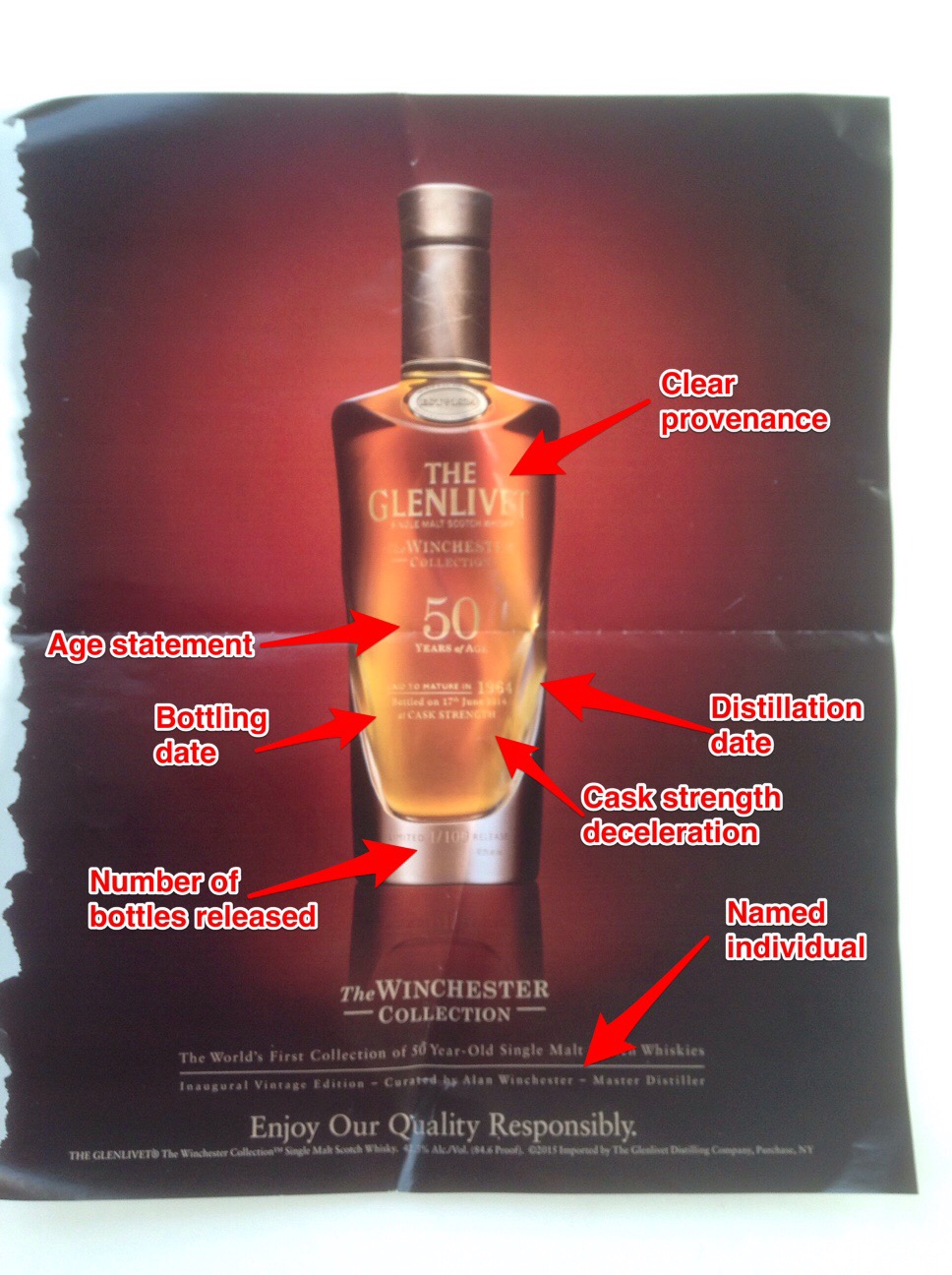
On a recent flight this print ad jumped off the page and not just because the drinks cart was heading in my direction. Now firstly I have to declare a historic interest,   The Glenlivet is a brand I used to work on and indeed still drink (particularly the 18 years old).  However back to this ad.

Why do I like it so much ?

Most importantly it's beautifully shot - this creative is ALL about the liquid and that shines out brightly.   Authentic with not a trace of artifice - something which is also reflected in the product itself - which makes this simple but effective advert all the more powerful.

Over the last decade many whisky brands have played fast and loose with liquid credibility (what's in the bottle).  Dropping age statements and using layers of marketing to distract attention from what is invariably younger whiskies as they have endevoured to keep pace with demand.   That compromising for short term commercial gain has invariably chipped away at equity.

Not so here.    I've marked out all of the key designators on the bottle - each important and together giving a comprehensive picture of exactly what is being purchased and hopefully drunk and enjoyed !

This is an expensive purchase which requires nothing but clarity - here The Glenlivet let the bottle do all the talking and it works.

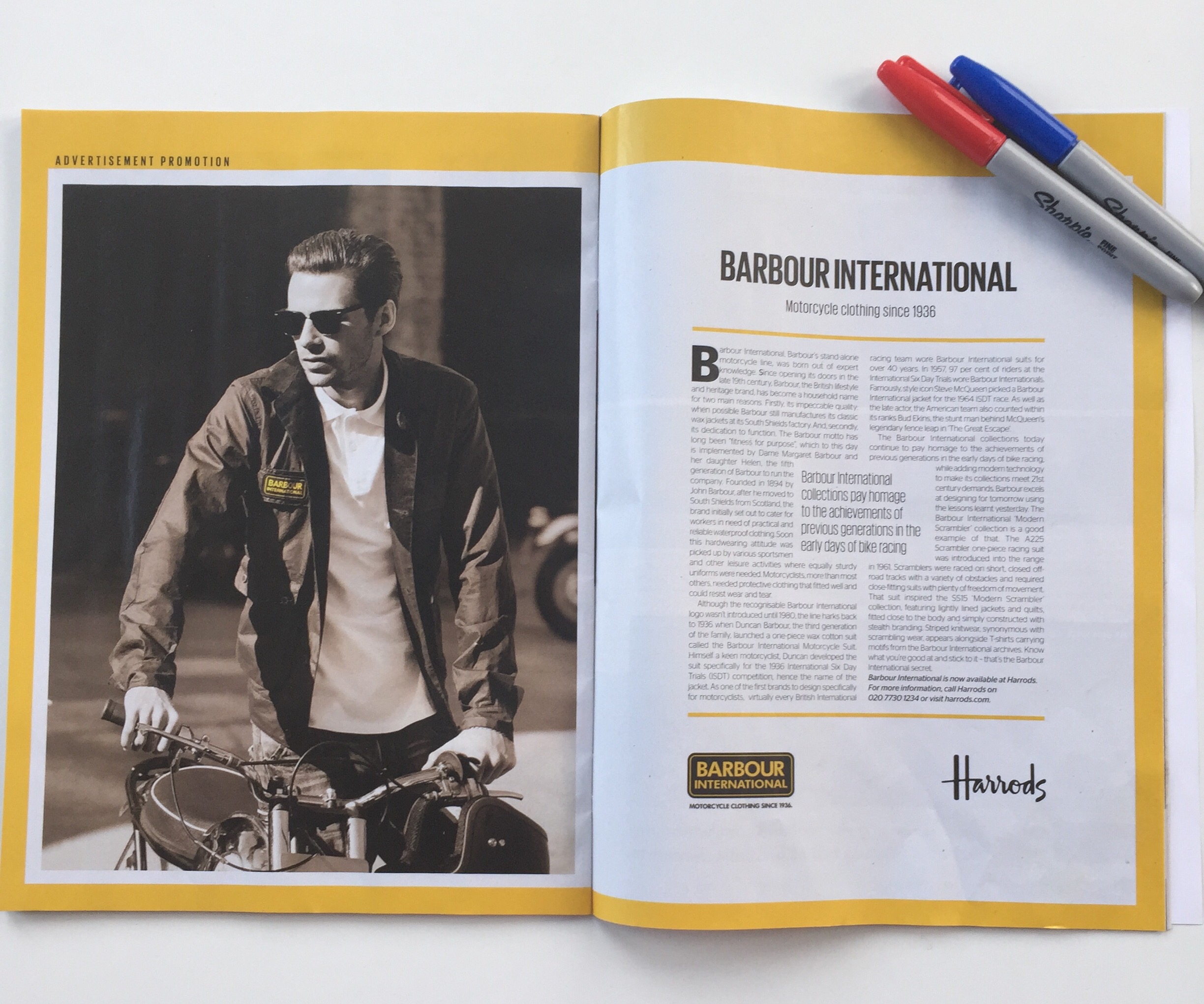
Crimes against advertising - Barbour International

Regular readers of this blog will know I have a problem with copy heavy advertising.   Put simply there can be no justification for acres of copy which are never read by the target consumer.    It's wasteful of the opportunity.

Any yet brands continue to do it, especially the smaller ones who labour under the illusion that they need to sweat the opportunity by cramming as much in.

Now to be fair the example below is an 'advertising promotion' and the presence of the Harrods logo suggests it's some sort of co-branded collaboration but that's no excuse.


Dull, almost anemic, wordy and when you consider the publication it appeared in the crime is doubled.   ES is the magazine of the London Evening Standard distributed on a Thursday evening - it's an evening commute publication and so it's designed to be a fast paced read.   Highly visual and engaging.

It's all the more tragic because this is a great brand which is having a resurgence - shame this was an opportunity missed.

The brand now departing from platform 17

I have never taken a virtual train journey.  Never until this morning that is.  A friend was heading north from King's Cross, London on the newly transferred back to the private sector East Coast Mainline rail service.

Now this friend has an eye for detail.  And a strong sense of what's right when it comes to customer service and customer experience especially when related to travel.

Or in the case of this journey - what's wrong.  

His live commentary via WhatsApp is as entertaining as it is a train wreck (sorry) of missed opportunities.

Virgin (along with Stagecoach) assumed responsibility for the franchise over the weekend.  And as is usual with Virgin a rebranded train was showcased with accompanying hyperbole.   That's the Virgin way - lots of hat, not much cattle.

It's great for a quick gulp of PR oxygen but it has the tendency to raise customer expectations.   Don't get me wrong my friend was not expecting Virgin Atlantic 'Upper Class' but he assumed if it was good enough to brand the differences would be tangible onboard.  

They weren't.  He was in 'First Class'and at least got fed a mediocre breakfast, much delayed (and heaven help you if you're on the train over breakfast AND lunch - you are allowed only one meal so choose wisely) the poor blighters in 'Standard Class' had no 'at seat trolley service' because of a lack of staff.

Smart uniforms from the state owned service have been replaced with shoddy sweaters.

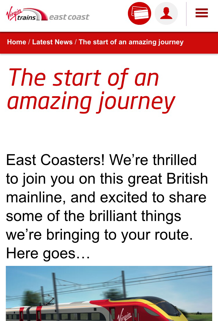
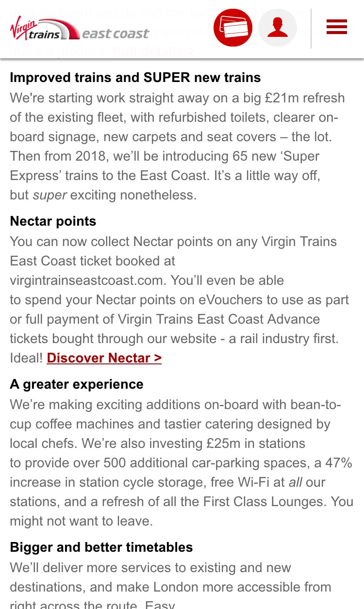
Now I'm not underestimating for a second how difficult it is to effect both an operational and a branding change at the same time.   And they have tried to caveat that with their "Start of an amazing journey...." tagline.


I would just have advanced the argument that a partial rebrand is worse than no rebrand.  Branding is not just about sticking a new logo on the menu and the side of the train.   It runs deep into the entire product experience.   

Virgin should have focused on the operational changeover.  Communicated the changes that were coming and offering a free beverage onboard for the foreseeable future to 'seal the deal' with a tangible gesture.   Then worked behind the scenes on the product and brand - launching the new service only when ready.

Brand and experience inconsistency is deeply damaging - my friend's journey could so easily have been a very different and more future thinking experience instead the Virgin brand just lost a fan.


Bremont - keeping perfect time through passion and consistency

Whenever you get the chance to meet with or listen to a creator.  Do.   It's an experience which never fails to inspire or motivate as you hear, first hand, the unique story behind their product and brand.    It's a reminder that brands are built with blood, sweat and tears - even when it appears, retrospectively, effortless. And so it was on Wednesday evening with a talk by Giles English one of the two brothers who co-founded The Bremont Watch Company back in 2002.

The experience was heightened because it was in the intimacy of a private club and there was ample opportunity for candour and questions.   However, I suspect that such is the authentic and honest approach that Bremont make to their work it's a very consistent message !

Afterwards over dinner my guest (he is both a fellow brand expert and a lovely of all things horological) and I discussed what makes the brand tick.

Firstly, it's important to recognize that what the English brothers have achieved is nothing short of miraculous - it would have been hard enough without being set against the backdrop of economic downturn and competitor brand consolidation into the mass luxury maisons.    And all without the financial backing of a parent brand.  But turn those facts on their head and you can see that those negatives are a contributing factor to the survival and success of Bremont.

Successful brands require three things;

- a credible product proposition  (watches hand-built in the UK)

- a clear set of defining principles (precision, durability, aviation, mechanical, British)

- passionate consistency

Bremont has all three but more than anything I put their success down to passionate consistency.   The individuals that had the idea, founded the company and continue to run every aspect are the same.  That ensures product consistency but also executional consistency.    Ironically a few days later the UK marketing news covered another luxury brand I follow which is on its third creative agency in two years.     It almost seems to be a truth that the bigger the budget, the bigger the egos and the more need to "chop and change"  leaving the consumer confused and the brand in question becalmed.

That passion also ensures that every penny is spent wisely - events, advertising, partnerships are not frivolous but sweated - there is always an opportunity cost to the activity so the right decisions are made.

Bremont is, thankfully, not the only example but it's the one which has made the most lasting impression on me.  It's a reminder that the limiting factors to success are passion and consistency - not investment.

All of us involved in brand creation and management would do well to remember that.

The luxury of Instagram

@Gucci has over 3.3 million followers on instragram. @fikanewyork a Swedish coffee show chain in that city that I frequent has just under 2,500 followers. I follow them both. Instragram is a social medium phenomenon which luxury brands big and small need to harness and harness well. With over 300 million monthly users and, after a major purge of fake users followers, it is a serious and relevant channel for brands which crave the engagement of their fans and customers.

For a channel which allows the posting of one image (or a mosaic of images displayed as one image) a little text and some hashtags (more about these later) the ability to excite and engage consumers beyond other mediums is outstanding. Instagram outperforms twitter and Facebook to an extraordinary degree and it is a democratic channel. A brands efforts are not limited by budget but only by creativity and authenticity.

Why does Instagram resonate with the user so well and why is it a perfect medium for luxury brands ?

In my opinion it's all about experiences and travel. It is a social channel which requires very little effort by the passive user - just selecting the brands, organisations and people you are interested in following and either ignoring, liking or occasionally commenting on what you see. It is also a pure experience with none of the usual noise (twitter / facebook) or complexity (pinterest) that other social media channels bring.

It's an effortless scroll through a world of experiences. I ( @markaizatt) follow just over 500 brands, locations and people. The things I follow reflect my interests - luxury, travel, food, drink, aviation with some random items thrown in. Serendipity plays a great part in Instagram hence I follow @deluxehomediary (a London based Instagramer who turns the most mundane domestic occasions into a visual feast) so over time you start to follow people who have similar interests and passions.

In many respects it is a passive distraction when you need it most (during boring commutes or first thing as your mind wakens up - I enjoy reviewing where my friends have dined in NYC the previous night) or an active pursuit when travelling. Sharing what you are doing.

And this is where luxury brands can either get it right or fail. A brand Instagram feed is not about constant product shots (boring) but many brands make this mistake and some even run their feed as a fan club for their CEO - nothing will turn off followers more. Instagram is a window to make your brand a relevant part of your target audience lifestyle. So posts have to be dynamic. It can't be all about the brand even when it clearly is. An example of a brand trying to escape product focus and engage more is @IWCwatches. Lots of posts of static watches = BAD. Running a competition to engage follows = GOOD. @Cartier is another good example of bringing a more informal feel whilst still being true to brand values.

IMG_9510

IMG_9509

IMG_9511

Hashtags (in a restrained manner) are a way of tapping into trends and helping others find you through relevant terminology. Particularly important if you are a new brand. Try and own something which is "on-brand" but going to be picked up by your demographic. Don't overreach - some brands do this and the result is an air of desperation.  Instagram is also 'of the moment', there is little point in posting after the event - for example 48 hours after the Oscars.  You'll also come across powerful consumers who have a large following but are committed to the brand. They'll curate their own purchases and tag your brand. These fans are vitally important and they need to be encouraged and engaged - trust me they enjoy the recognition

Like swimming Instagram is best experienced by jumping into the deep end. If you simply want to consume but especially if you want to establish best practice for your brand.

Luxury brands by their very nature are visual - Instragram needs to be at the heart of your engagement strategy.

(Over) cooked goose ?

A few weeks ago, when I was in NYC, I was struck by the sheer number of Canada Goose winter parkas which were being worn. True it was exceptionally cold but this was a 'bird' which usually stands out (the arm patch is almost as big as the polar ice shelf) because spotting an example was a rarity. Not any more. I gave up counting and, more importantly a bit of on the spot ethnographic work (a fancy term we marketers use for staring at people) made it quite clear that this expensive item was being worn by a wide demographic range. In essence it's gone from exclusive to mass in about 12 months.

That's a good thing right ? Especially for the owners of Canada Goose, Bain Capital, who must surely be contemplating a sale.

In the short term it has to be a "yes" but I would qualify that with the brand having the ability to sustain the impact of ubiquity. A few years ago the wearer made a signature statement donning one - now it's relatively mass attire.

That makes life tricky for a brand unless they can quickly side step into new items and develop their franchise. Louis Vuitton has been a master at this. It's obvious who has a historic purchase, or worse still a fake and who has the latest season.

Exclusivity is not the only foundation of luxury but it is an important one. The ability for a brand to achieve immense velocity has never been easier but that applies to ALL brands which have a winning proposition, including the NEXT hot brand. As fast as you climb the reverse is true.

It seems that no one is ever content with creating a successful brand with longevity only one which saturates the marketplace and then burns out just as quickly.

Perhaps Canada Goose can have it both ways and it could do worse than looking at Moncler which is establishing a bit of depth as well as breadth.

Meanwhile I'll wrap up.

Old whiskies, new ways

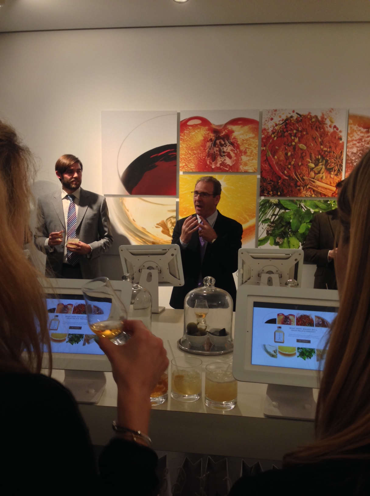
Having had the privilege of working in the super premium and luxury single-malt whisky categories for about 12 years I cannot resist an invitation to attend a whisky launch. Poacher turned gamekeeper or perhaps it is the other way round, no matter, I was both thirsty and intrigued by the invitation to attend the Glenfiddich Gallery last night in Mayfair, London. Scotch whisky is an incredibly competitive category, that's what makes it so compelling for both the practitioner who has to cut through the clutter to win the hearts and throats of the customer AND the whisky drinker. It's a drink which is tightly regulated and one which comes with a lot of heritage. Those two factors make innovation challenging but essential if a brand is to survive and flourish. Which is why Scotch whisky is one of the best examples of brand building. But I digress.

Last night Glenfiddich, the flagship single malt of William Grant & Sons, still owned by the original founder's family, launched the 'Glenfiddich Gallery' a collection of limited edition whiskies which have been selected by their Malt Master, Brian Kinsman. Other whisky brands have done something similar, I helped to launch The Macallan's 'Fine & Rare' collection about 10 years ago, but Glenfiddich have cleverly tapped into the growing demand for customer personalisation to create a proposition that goes further.

photo (2)

That personlisation begins with four simple questions which help to explore your whisky palate. Anything which helps a novice explore and understand which whisky is for them gets my vote. In some respects it can be easier to stumble upon the wrong whisky than the right one and this approach takes the mystery out of the process.

photo (3)

At the event, this was recreated using an iPad and being able to then see a whisky which matched your palate bottled in front of you for enjoyment later.

photo (4)

photo (1)

That personalisaton continues at the other end of the customer journey - with the purchaser having full control over packaging and messaging. This is a potent option which enhances the entire gifting potential.

Sensibly they have also brought an additional element of experience into the proposition with distillery based experiences included with some of the pricier bottlings (which start at £390 and go up to £100,000). I may quibble with the naming of that option, 'Platinum Experience', but it's a smart thing to do. Luxury brands need to have a manifestation beyond

The Glenfiddich Gallery works as product range and customer experience and, for a change, the launch event succeeded in bringing alive the concept in a very immersive way which was true to the proposition.

Oh and the whisky passed muster !

Haven't I heard that before.....?

The Germans have a great word for a tune that you cannot shake. "Ohrwurm" or earworm which gets stuck in your head. In this case it's not the last piece of music I heard on the radio before leaving home, it was a radio advert for Shop Small UK, the excellent initiative from American Express which encourages people to only shop in local stores on Saturday 6th December. This is the advert here - the radio version is the same.

[embed]https://www.youtube.com/watch?v=kfUBY12OaYE[/embed]

Once you've listened to this then listen to this advert from British Airways back in 2011.

[embed]https://www.youtube.com/watch?v=XozHLoqwp_4[/embed]

I've not had time to research the creative source of either advert but the similarities are quite marked.

Surprise packages

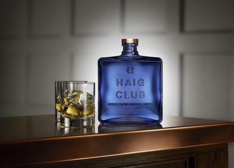
On the flight north to Edinburgh last week, an appropriate destination given the topic of this entry, I was thinking a little about the launch of Haig Club by Diageo. haig-club-main-sho_482

Fronted by David Beckham it is, quite clearly, a very engineered product and brand. That's resulted in a bit of, what I think, is unfair criticism. Diageo have been bold in their approach with the clear objective of reaching a younger, more fashion conscious, less whisky centric consumer. This is genuine new productive development and the marketing assets, including the film below, have all been delivered to a brief which reflects that target.

[embed]https://www.youtube.com/watch?v=MaMuQPmzrrU[/embed]

Is the whisky any good ? I've yet to try it but I admire their approach and commitment. All of this contrasts with what jumped out of the in-flight magazine as the breakfast tray was cleared away.

dew

If Diageo had just been awarded an "A for effort" this latest attempt by Bacardi to build equity in their flagship blend, Dewar's, deserves no more than a "Gentleman's C". In their efforts to try and pass off this blend as a single-malt I guess (what's wrong with blends anyway ?!) they have raided their packaging agency of every premium cue available - embossing, gold, cap strips, foils. Rather than elevate what, I am sure, are fine whiskies they have pushed these expressions into the clutter of the single-malt category.

You would be hard pressed to see a more staggering difference in approach. They say fortune favors the bold - in which case my money is on the blue bottle !

A perfect piece of Switzerland in London, W2 - when brands get retail right !

The rise of the mono-brand boutique is a phenomenon which shows no signs of slowing down in the luxury retail world. Brands rightly want to control the total customer experience and, moreover, increase their share of voice - many have complex stories to tell and cohabiting with other brands just does not 'cut the mustard' ! That does not mean that the creation of dedicated brand environment is easy or painless. Is an expensive proposition and that's assuming a brand can secure a credible space in one of the world's prime luxury retail locations. However, even with the digital experience growing in relevance and influence, the physical manifestation of a brand is essential.

And so it was a perfect start to the week that I chanced upon Bally's new flagship boutique on New Bond Street in London between meetings. Over three floors Bally have excelled in every criteria, they have created an environment which is so true to this Swiss brand that you feel you are part of the very fabric of the company from the second you step over the threshold. This is a true brand "cathedral". You may come to buy but you are certainly going to leave having paid tribute to the craftsman and designers current and past.

What makes it so special ? Words or the few pictures I quickly snapped do not do the experience justice but I will try.

This boutique caresses the senses from the first breath you take in the space. That heady smell of leather leads you by the nose from display to display. The lightning and decor are all about showcasing the merchandise to the best possible effect whilst, at the same time, using a degree of whimsy to encourage contact with the items. Bally is meant to be worn and that means touching - this isn't a museum. Felt pads and light wood ensure this is an environment without a trace of artifice. The detailing is as extraordinary as it is effortless. This speaks for a confident brand embracing modernity without compromising heritage.

The architecture is 'spare' and 'modern' but with a Swiss 'warmth'. This is not the aloofness of Scandinavia but a hybrid of efficiency and indulgence - the leather tape wound round all of the stair banisters, a perfect grip but yielding and a reminder of the craft that runs through every product in-store. The stairwell made me feel like I was moving between the floors of an Alpine resort. The Gentleman's Corner on the 3rd floor begs you to linger and get to work on a bespoke item - the only thing missing was a glass of something more appropriate for the early evening.

I would instruct other brands to look at how Bally have succeeded but that would be pointless - this creation is "so Bally" there is only one lesson to take away, be utterly true to your brand and you'll deliver the perfect retail experience.

B1

B2

B3

Driving you to drink

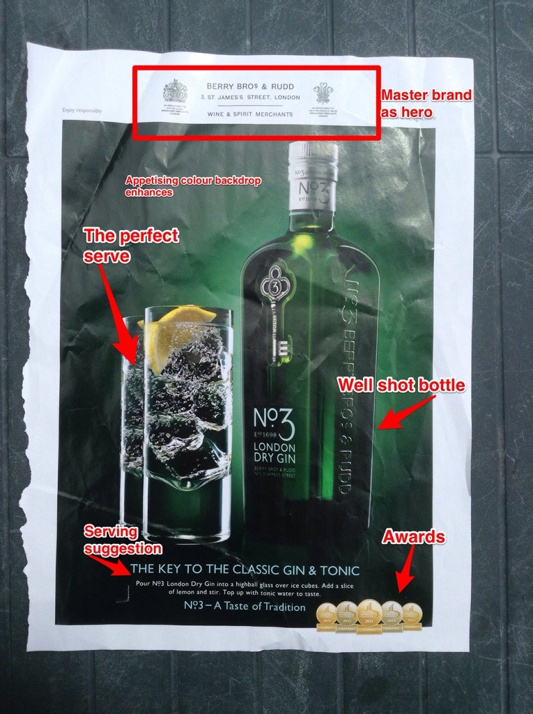
Flicking through The Spectator magazine over the weekend (a perfect publication to hit the premium alcohol beverage drinking demographic) I came across two ads printed on opposite sides of the same piece of paper. Two print ads.

Two different spirits. One gin and one single malt.

Two different creative treatments.

One success.

One failure.

I've included both ads marked up so you can come to your own view. Drinks advertising is not difficult. Most importantly you need to convey a sense of appetite in the target customer. It's about the liquid in the bottle and here the No 3 Gin trumps Glenfarclas.

If only it was just that - but Glenfarclas commits crime after crime with this advertising. A creative which takes every Single Malt Whisky cliche, dumbs them down, places them in an instantly forgettable and drab context and uses a bottle shot presumably taken with the final shot in a roll of film left over from a 1977 holiday to Dunoon.

Dreadful and certainly it made me yearn for a gin and tonic.

20140707-164506-60306516.jpg

20140707-164507-60307603.jpg

Retail is all about empowerment

Technology has made bricks and mortar retail a difficult place. It requires the brand, if it desires a physical retail presence, to make a special effort to engage the customer. A truly immersive experience helps, as does stocking unique items which are only available in store above and beyond that it all comes down to the retail staff themselves. It's those staff members who interact directly with the customer and, especially in the world of luxury goods, are the front line in selling the emotional and the rational benefits of purchase.

Last Sunday I had the perfect (and I use that descriptor deliberately) retail experience at Jack Spade's Brewer Street, London store. Readers of my blog will know I'm a Jack Spade fan but I had only gone in to kill a few minutes before a nearby lunch appointment. Regulars will also know this is usually a fatal mistake for me.

Firstly Jack Spade staff always seem to have the Jack Spade DNA running through them. They look like their customer base and behave as if the company is theirs. It's a recipe that's conducive to selling.

Dan walked over and engaged me in conversation about the bag I was looking at. Quickly establishing that I'm no stranger to the brand but also taking time to explain the functional qualities of the fabric. We chatted some more and I decided to purchase.

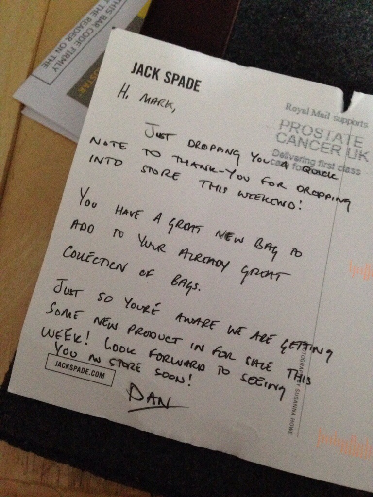
Now, for whatever reason, I've always managed to not be on their database (the lifeblood of a luxury brand) as he completed the transaction he causally signed me up and then after finding out what bags I had bought previously gave me a 20% discount card to use against all future purchases. It was entirely discretionary. The power lay with him and he obviously knew when to make the offer. He then said he would keep in touch and drop me a postcard.

And he did. Reinforcing the message with a little call to action for me.

It's a textbook example of hiring the right staff and empowering them to act in a way which can only help the business. And here I am writing about it.

They also make awesome bags so go and take a look !

20140629-194034-70834185.jpg

Brand pivot at 35,000 feet

Brands that successfully change their positioning to either gain new customers or grow with the changing aspirations of their current customer achieve a feat which few manage.   To do so without a single performance bump in the road or, in the case of easyJet, the sky and you are toast of the financial community.  Investors and customers happy. Last week easyJet posted a 4.1% increase in passenger traffic in March against a 4% decline by Ryanair.   Both budget carriers but with a very different view on customer service and the offering.     Ryanair compete only on price and, up until a declared change of heart a few months ago, have shunned any form of support for the passenger.   That combined with a tendency to fly to lower cost and therefore geographically remote airports meant that they have been unable to embrace the business or older leisure traveler.

The credit for easyJet's brand and product pivot lies with their CEO, Carolyn McCall who joined the company four years ago.    Appealing first to the business traveler by coming up with fare structures and flexible change policies at a time of austerity meant that more and more corporate fliers turned to them.     More recently the decision to end 'open and un-allocated' seating removed a major hurdle to the older traveler who ruled out the easyJet option for fear of the unknown.

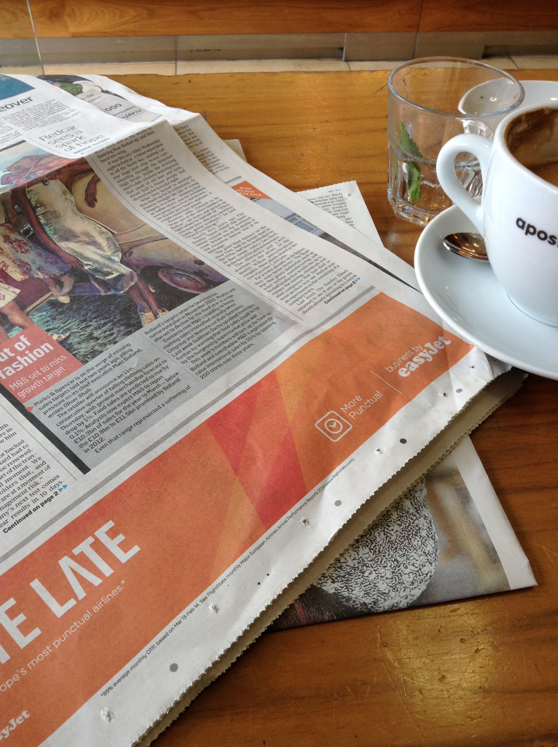
Supporting all of this has been an energetic advertising campaign which maintains the energy of the brand and focuses on (1) seating, (2) app based ticketing and (3) punctuality.

https://www.youtube.com/watch?v=ywUJJwNmjJw

And placing very tactical print adverts such as this one in today's Sunday Times Business Section.

easyJet

It's been an effective positioning pivot - maintaining values and bringing the established customer base on the journey and attracting new users - it's a perfect example of getting it right.

Porter(in)house

If you have ever been inside the inner workings of the luxury taste making machine of Net-a-Porter it is like some 21st century dark satanic mill. Apart from the fact it's very light, and comfortable and buzzing with positive energy but, and stick with my analogy, it is vast enterprise. Desk after desk, screen after screen, elegant angle-poise light after elegant angle-poise light. And, ironically enough, sitting on top of one of Europe's biggest traditional luxury / premium shopping malls - Westfield in West London. It's a sight to behold especially when your gaze turns to the large screens on the wall showing the flurry of orders from all around the world.

And make no mistake it's here to stay and eager to remain as innovative and relevant as the day when it was founded.

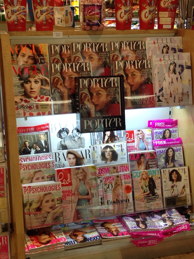
Which makes their latest move, to launch a glossy magazine, priced £5 on the newstands incredibly savvy. A maxim I particularly like is judge someone, not by their friends, but by their enemies and the terse commentary which greeted the arrival of Porter from publishing industry stalwarts such as Vogue said it all.

This is a very solid proposition. A magazine locked into a company which sells product - marry up those subscriptions with the order history of the subscriber and you have the sort of insight and messaging opportunity which advertisers dream about.

I've passed the first edition around an audience I respect and the reaction has been solid. Strong content, visually appealing and a welcome addition to their browsing.

And cleverly that £5 cover price represents a premium on Vogue's £4. Effectively using price to say "we are better".

Traditional print needs this sort of provocation. It's a reminder that paper based media can still be relevant. And interestingly enough we men have benefited from the free broadsheet, Mr Porter, for some time. Carefully collecting it from the airport lounge and using it to help our own shopping or those who buy on our behalf.

20140301-195858.jpg

Chinese carry out

Today's UK Times newspaper has an article by Carolyn Asome which gives further evidence of the dynamic at play in the world of luxury fashion provided by the Chinese consumer.   In Britain, not a country with particuarily easy visa access for the Chinese, the numbers visiting will rise in 2014 to 204,000 from 89,000 in 2012.   Moreover their spend is high.   She quotes a figure of £1601 (USD $2628) as the average value of a single transaction by a Chinese visitor within the luxury shopping districts in London of Mayfair, St James and Bond Street.  Little wonder that both growth and tastes are being influenced by this powerful group of consumers - her particular focus is their impact on couture.  

The Chinese love to travel.   The Chinese love to shop when they travel.    It's that maxim that drives the figure quoted by Bain & Company in their 2013 "China Luxury Goods Market Study"  - two-thirds of Chinese luxury spending is being carried out abroad.

None of this is a surprise and yet some brands seem to be sluggish to respond to a luxury growth slow down in China from 7% in 2012 to 2% in 2013.    Over expansion of their retail footprint instead of genuinely engaging with the consumer has seen footfall decline and profitability plummet.   All of this in the context of a trend to more restrained (government enforced) displays of wealth.   Nowhere is this exhibited more than in watches where growth has declined by 11% over a year.

All of this pushed me to sneak a look at an article I had written last May for Luxury Briefing's June 2013 edition.   The editor and I opted for the headline "China - Reasons to be cheerful" because my prognosis was, and still is, for a positive performance for luxury brands who enage the Chinese consumer.   However, in that article I argued for nuance of approach and suggested that brands had to change their ways.   Nothing I've read or observed recently suggests I was wrong.  For some brands it might now be too late.

The parable of the five grocers

In this first posting of 2014 I'm sticking close to home. It's a UK centric example with global relevance. It concerns five mainstream, well established and iconic general retailers - Waitrose, John Lewis, Mark's & Spencer, Tescos and Morrison's. In my opinion it's a neat little parable about brands getting it right AND getting it wrong. The Players

Waitrose - a general, national food retailer which has positioned itself (through association with Heston Blumenthal) as being of the highest quality but with a commitment to helping people save. It's retail environment is upscale, it was one of the first food brands to embrace eCommerce and it's latest loyalty scheme includes an almost instant gratification of a free coffee.

John Lewis - clothing, furniture, electronic goods, make-up - a traditional department store owned and run by its employees, with non-jargon based and honourable commitment to "never being undersold. Strong positioning with an innovative "click and collect" scheme.

Mark's & Spencer - famous food and clothing retailer. Exceptional (for that category) ready meals, pre-cooked and party foods, full range of clothing and household goods. Ubiquitous - on every high street and used by every demographic. Constantly suffers from an identity crisis. Discounted heavily throughout the holiday season.

Tescos - middle-of-the-road, mainly food retailer which traditionally offered value but was tainted by the horse meat scandal and never recovered. Mid-rebrand (adding wood into urban stores, aping Waitrose, in an effort to upscale. Now undercut by brands such as Lidl.

Morrison's - a grocer who had crafted a proposition around freshness but who conceded ground, joins the eCommerce world for the first time this month.

The Trading Results

You have probably guessed the position already.

Waitrose and John Lewis are UP.

Mark's & Spencer are STATIC

Tescos and Morrison's are DOWN.

Learnings

- A brand is either premium priced or budget priced. The middle ground has disappeared.

- An established brand will never be able to discount its way out of trouble.

- A brand must have a clear positioning, So clear that the average person in the street can describe it.

- Brands that fail to innovate will fail. The high street fashion brand, NEXT, delivers the SAME day in many cities - their sales are dramatically up.

- Consumers crave online shopping - even if they still want to collect in-store.

Defensive CEOs will talk about weather patterns, general malaise, sunspots.....but the truth is the brands with a well executed strategy are thriving.

A lesson for us all.

Here we go round the Mulberry bush...again !

Mulberry as a brand always seems to be in a state of hiatus, it emerges phoenix-like every couple of years and then splutters.  Last week it announced a 28% fall in pre-tax profits for the first six months of and its online sales are down.     This dip in performance coincides with the brands strategic transition from being a brand which has had relative success at the 'aspirational' luxury price point to one which commands a higher price.   In other words moving from approx £200 - £600 to £700 - £1500.  On the face of it there is nothing wrong with the ambition and, when one sizes the market and looks at the competition which successfully operates in that price point, you could agree that it is a smart move. Except it's not.

It's a great British brand.   It's been operating since 1971.   It's increasing it's British manufacturing.  All of these are strengths.   But it's never been a truly luxury brand, it has never been craved by the target.

What is now working against Mulberry is international expansion on someone elses (the competitions) terms - especially when it's so cynically described by their CEO, Bruno Guillon.    Here is an example of him talking about his store expansion program "Chinese shoppers, for instance, need to see us in Asia but also see us in the right locations when they travel abroad."

In essence, Mr Guillon is saying Mulberry wants to operate in the luxury category in Asia and create the illusion of a luxury brand in Europe where that demographic does not favour Mulberry.   This is both a shame for the brand and for the targeted customers, and guess what, they will wisen-up.

Luxury branding is more than simply a stratospheric pricing policy and "hanging out with the cool kids".   It requires substantiation and a pedigree - repositioning an existing brand upwards is never easy and basing it on a new retail strategy is dangerous.    All of this could change with a bold creative direction (pending a new creative director) and collections which catch both the imagination and the wave.    I suspect time is not on their side.