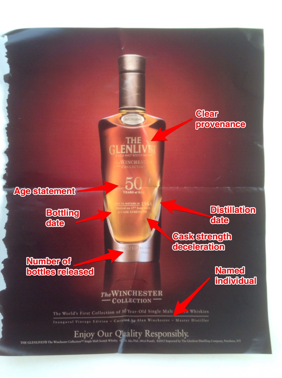
On a recent flight this print ad jumped off the page and not just because the drinks cart was heading in my direction. Now firstly I have to declare a historic interest, The Glenlivet is a brand I used to work on and indeed still drink (particularly the 18 years old). However back to this ad.
Why do I like it so much ?
Most importantly it's beautifully shot - this creative is ALL about the liquid and that shines out brightly. Authentic with not a trace of artifice - something which is also reflected in the product itself - which makes this simple but effective advert all the more powerful.

Over the last decade many whisky brands have played fast and loose with liquid credibility (what's in the bottle). Dropping age statements and using layers of marketing to distract attention from what is invariably younger whiskies as they have endevoured to keep pace with demand. That compromising for short term commercial gain has invariably chipped away at equity.
Not so here. I've marked out all of the key designators on the bottle - each important and together giving a comprehensive picture of exactly what is being purchased and hopefully drunk and enjoyed !
This is an expensive purchase which requires nothing but clarity - here The Glenlivet let the bottle do all the talking and it works.